Posts

Zen Diorama // 02

Image
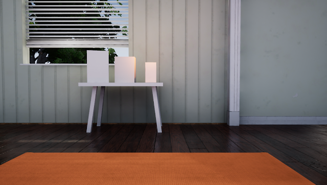
In this update I’ll show you the textures for the floor, generic models and the yoga mat. The scene is beginning to take some form now that I’ve started to include materials and assets, as you can see through the 4 development iterations below. The wooden floor material seems to have made the most impact on the scene so far. In my opinion this is due to the assets being reflected in the material, which assists in helping the scene look realistic. I had some fun creating wood grain in substance designer. Wood is quite tough to get right but I'm beginning to get the hang of it. To keep consistency I created all of the white-painted models using the same texture map, and baked all of them together. I may pull back on the dirt on these textures as the details seem to be overpowering in the renders. For the yoga mat I had to create a custom material to replicate the fine cushioned PVC that the mat is made out of. I used my own yoga mat as r

2 Simple Methods of Channel Packing for Unreal 4

Image
Can't seem to get your head around what channel mapping is? I didn't understand it at first either, but it's actually very simple, and also very efficient. I came across channel packing through Clinton Crumpler's lvl 80 blog post . Check it out if you haven't seen it. Channel packing is basically taking multiple textures and packing each one into the individual channels of an image. Each channel can then be separately used in Unreal.  Channel packing helps avoid the issue of reaching the texture samplers capacity (the amount of textures that can be used in a material, the maximum is 16) by having 4 textures packed into 1. Minimising texture files also reduces memory usage, which is great for optimising your Unreal scenes. It's up to you which texture goes in which channel, but I usually do the following: Red - Roughness Green - Metallic Blue - Ambient Occlusion Alpha - I use this for alpha, emissive, or even height if I know that it w

Digital Material Study: DIY Painted Wall

Image
I took inspiration from the walls around me and conducted a study of a painted wall that has developed a story through wear and tear over-time... that's a really kind way of saying someone did a pretty shitty DIY job with the paint, and now it needs another coat. Nonetheless it makes for a great study for micro-surface detail in a material! Check out the material on my Artstation The substance designer file is fairly simple. It was a fun challenge to get the paint chips looking good. Here's a closer look at the details. If I look closely at my university dorm wall I can see a lot of paint strokes that are at different angles, an easy solution is to an anisotropic noise and splatter the created effect. Other small details such as micro-bump details and indents in the wall were created too, these small details help bring the texture to life. I created some variation in the chip shape by using a few warp nodes. You can have a lot of cus

Zen Diorama // 01

Image
Now that I have some free time I decided to start a new project. The project's name is 'Zen Diorama', and is inspired by my yoga and mindfullness practise that has become an integral part of my life over the past year. The project focuses on a small area consisting of a room with a window, populated with only a few items, including a yoga mat, a table and three objects that are placed on the table.  The purpose of this project is to take inspiration from mindfulness by slowing down and allowing myself the time to learn the 'movement' opposed to focusing on the end product. This will give me chance to focus on some high quality materials and assets, while also polishing my Unreal skills. The main inspiration for this project comes from an image that I found on pinterest. The image shows a well-lit room with a lot of small details to work from. I'll be attempting to nail the lighting using Unreal 4. This gives me a great opportunity to lear

Colour Temperature

Image
I never really understood what I was changing when I tweaked the 'temperature' of a light in a game engine. I assumed it was simply a quick way of making an environment look warm or cold, which it technically does also do.  It was only yesterday, when I was watching Unreal 4 lighting academy session 2.2  I learned how to effectively use colour temperature in an Unreal 4 environment. The workshop-style tutorial focuses on lighting for Architectural Visualisation, but it's great practise to understand these principles to build up an accurate basis for a game environment. Colour temperature most easily simplified as a method for describing the colour characteristics of a light. the colour ranges from warm (yellow-ish) to cool (blue) with a pure white colour in-between, usually seen from the light emitted by the sun midday. The temperate chart annotations give examples of where you would see certain Kelvin values in real-world lighting sources. It's a rathe